Wednesday, October 28, 2009
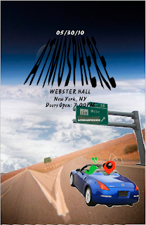
Atmosphere Concert Poster
I love Atmosphere so much that I decided to use them again for our latest project, which was to design a concert poster. My idea for this project was to represent Sean Daley and Anthony Davis (the members of Atmosphere) as their stage names. Sean Daley being "Slug" and Anthony Davis being "Ant."
For the background I didnt want to settle on just one color scheme so I used two images as the first layer. The first image layed out was the image of the the desert highway which I took into photoshop and cropped out the background and replaced the sky with another image of the Earths Atmosphere. I wanted it to look as if the Atmosphere was their destination not just the name of their Group.
The next stage of the poster was getting Slug and Ant in the car. This was the hardest part for me, considering I am not a big fan of photoshop. It was really irratating doin my best to get rid of all the white edges when cutting them out of the original image. The car was cut out of image from google and the Slug and Ant were drawn by me in Adobe Illustrator.
After finally getting the pieces cut out and placed and everything drawn. I needed to find a nice font for the poster. I looked through all the fonts in Adobe but didnt like any so I then search the internet for some spray paint font but the computers wouldnt allow me to download them. So I resorted to having to edit my own font that I made in Illustrator. I morphed an original font.
If I had a spent a little less time with the drawings, I would have been able to present the poster with better font with a little more color. But overall I was happy with it.
Monday, October 26, 2009
Atmosphere Music Powerpoint
I had a lot of fun with this project, it was a chance to show my favorite artist "Atmosphere" and highlight some of my favorite rhymes that he wrote. Besides having a tough time with getting the music to play along with the PowerPoint, this project was pretty smooth in creating and animating.
For my first slide, the title slide. I kept it pretty simple, because I felt that Atmosphere isn't a very flashy artist, he keeps it simple and and to the point. So i figured I would portray that in my PowerPoint, but at the same time keep it aesthetically pleasing. Although "Atmosphere" consists of Sean Daley (Slug) and Anthony Davis (Ant) its Slug that writes the lyrics so I decided to just show him on my title slide.
For my second slide, I gave an overview of Atmosphere. This was a slide to give some interesting facts about Atmosphere. In this slide I included the two members of the group, Slug and Ant. This was the slide I probably had too much fun with the entrance animations of the pictures and the title of the slide, but I still wouldn't change it. Gives a little excitement to the slide.
The third slide, which was the slide to show the Album Tracks and Album Cover. I ended up choosing my favorite album, "Overcast" which was Atmospheres first studio album. This slide was probably the easiest, the hardest part being how fast I wanted each track to come into the slide and how long it would be before it would fade to grey.
Fourth slide which consisted of the comparison table was the hardest of all other slides. When putting together my comparison table I noticed that when I would animate each word the whole table would come into the slide as one piece. I noticed that some people would create a new text box for each section in the table, but I liked the way mine looked, so I ended up just making the time of transition for this slide much longer then the other four. This giving people more time to read the information on the table. This slide also gave me an excuse to include some of my other favorite artists. Finding out how they compare was really interesting for me.
The fifth slide which was my favorite, gave me the freedom to play with some of my favorite images of Slug and Ant. Some showing them on stage during a show I attended, Slug and Ant hanging out, and another Album Cover I love to listen to. I also got to play with all the animations for each picture, every single picture has a different entrance and specific placement.
Thursday, October 1, 2009
Collage Animation
For my collage video I chose five photos that I thought went well with my font poem. I included a picture of my friend in headphones, a microphone, my favorite artist on stage, wings of a swan, and the earth in the background. When people look at my collage for the first time, I want them to imagine how music can lift you off this planet. I placed the swan wings behind my friends face to emphasize the imagine of flying while listening to music. I was also able to play with the opacity of the words in the font poem, and I decided it would look better if I had the words dissolve after appearing for a short time. In the end i decided to leave "Flight to the imagination" on its own because it shows what impacted me the most from the poem.
Font Poem
Music is a moral law. It gives soul to the universe, wings to the mind, and flight to the imagination.
-Plato
I chose this quote because I feel that it really shows how music makes me feel and shows the way my favorite philosopher feels about music and its beauties. Music has always been able to inspire me to love new things and appreciate everything for what its worth. You can get away from places with music and you can go distances with as well. Without music in my days i would not be able to function.
So for this assignment I had to first start off by putting each word from the quote on its own layer, with each being on its own layer I was able to transform each without effecting the other words. The effect in the layout of my poem that I wanted to express was the highlight of each important word. Making each important word very different, bigger and the use of a font that represented the word to my understanding. The fonts that I used for this assignment were Visigoth, Univers Lt Std, University Std, Strumpf Std, Myriad Pro, Serpentine, Arcana GMM Std, Andreas Std and Ouch! Std. Picking the fonts for my poem was probably the hardest part considering I had trouble making up my mind for most of them. After finally picking the fonts, I began playing with the placment of all the words, I decided to make everything pretty much to one side with the last frase standing on its own in the negative space of my document. The word that stood out the most for me in the poem was "imagination" therefore I made it look like it was the most important word in the poem.